KINNECT is the student community app concept I branded in Logo & Pictogram Design. For the final project I made a 26-page process book, split into three phases: research and strategy, concept development, and production.
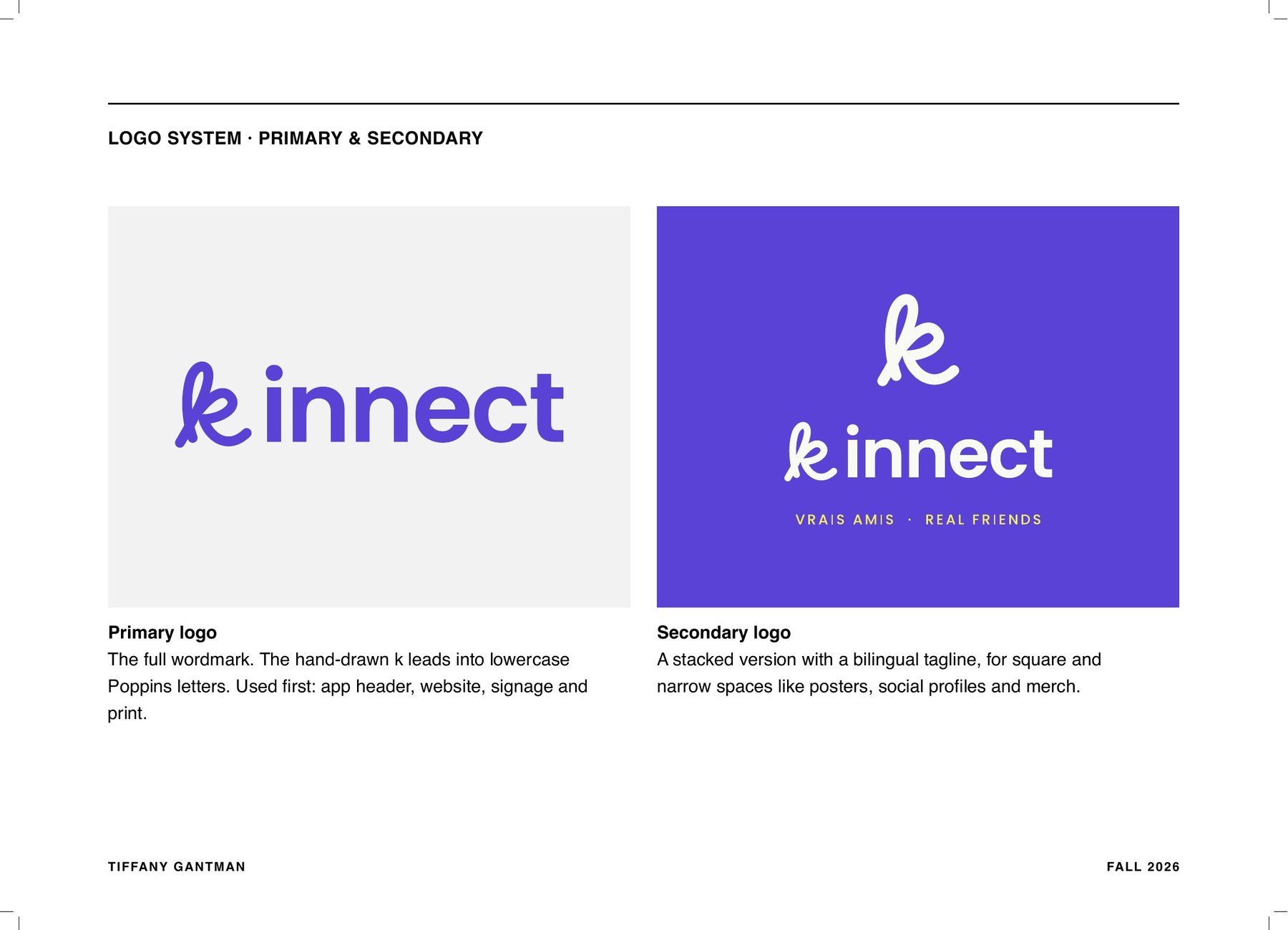
The primary logo is a hand-drawn k that leads into lowercase Poppins letters. The secondary logo stacks the k above the name with a bilingual tagline, Vrais amis · Real friends. There is also a round submark with Montréal in the ring, an icon, an app icon and a 16-pixel favicon redrawn pixel by pixel.
There are four colours. I picked blue-violet for trust and creativity and citron for invitations and actions, plus black for text and a warm white taken from uncoated paper. I checked every pairing for contrast so the brand works on screens and in print.
To test the system, I placed it on app screens, business cards and a metro platform floor decal that says Rendez-vous ici · Meet here.