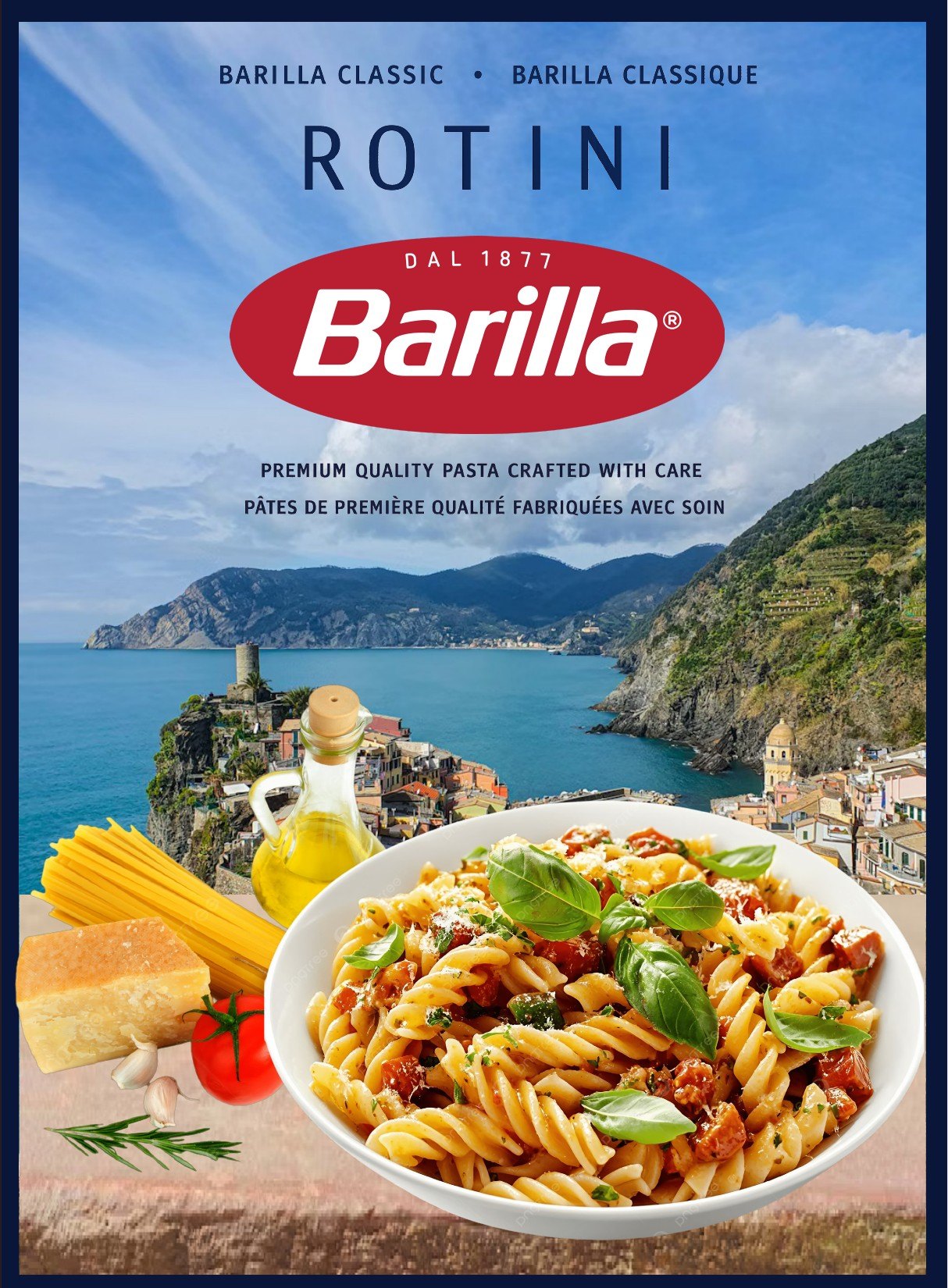
For this class exercise I redesigned the front panel of a box of rotini. It is a student project only and is not affiliated with the brand.
I wanted the box to feel like a postcard from the Italian coast. A seaside village fills the background, and a bowl of rotini with basil, tomato and parmesan sits in front.
Because the box would be sold in Québec, every line is bilingual: Classic and Classique, and a short line in English and French under the logo. I kept the product name in wide spaced capitals at the top so it reads from across the aisle.
The photo is pretty busy, so I put the logo on a clear patch of sky where it is easy to spot.